
From Tiffany blue to chocolate brown: why colour matters so much in luxury watches
For years, buying a luxury watch meant playing it safe.
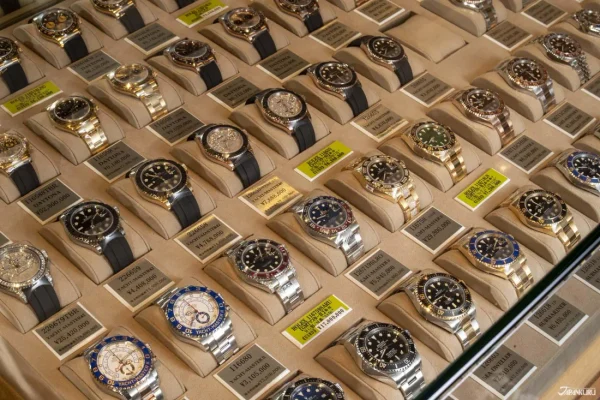
Black was smart and silver was timeless. A few whites started knocking about and they went with every outfit. Then came blue and that was as adventurous as most watch collectors were prepared to get.
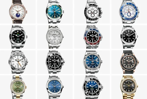
Then suddenly, watches weren’t just about the movement or the brand name. The dial became the star.
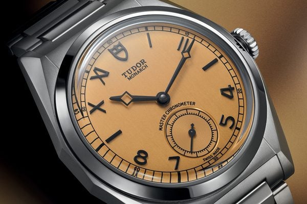
Tiffany blue, racing green, ice blue, salmon, chocolate brown and even burgundy began turning perfectly respectable watches into highly sought-after collector’s pieces.
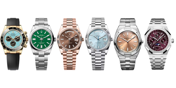
And it turns out that colour can make a surprisingly big difference to how desirable a watch is…
Not just a colour
A particular shade can become associated with a brand, a model or even a specific reference. Once collectors start attaching meaning to it, the colour becomes part of the watch’s identity.
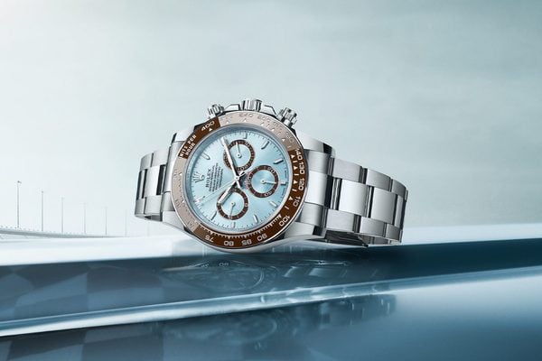
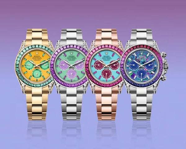
Turquoise for example. Here at LW, we love a turquoise dial – and Rolex has produced plenty of colourful watches, but turquoise has become particularly desirable. Obviously there was the association with Tiffany & Co there and the major love for the bright colours in Rolex Oyster Perpetual models.
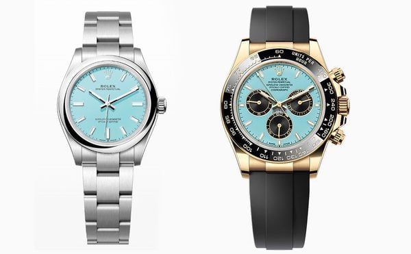
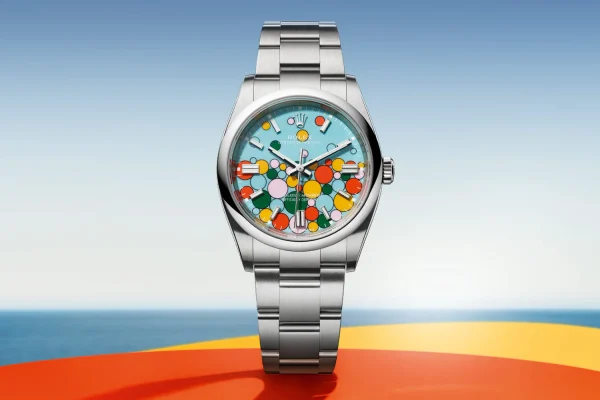
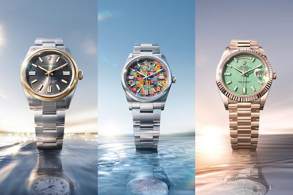
The Rolex Oyster Perpetual 41 Celebration Dial combines a turquoise-blue background with colourful bubbles in pink, yellow, coral and green. (If we’ve wet your whistle, check out an unworn 124300 here).
Unusual to iconic
Green is another excellent example of how a colour can completely change the personality of a watch.
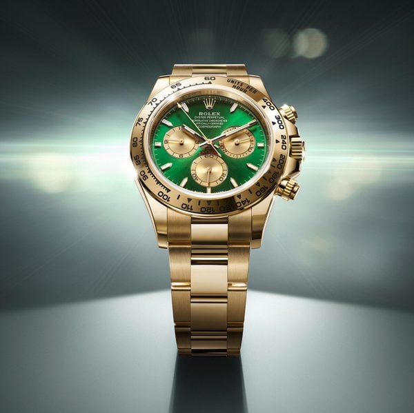
Rolex’s green dials have become particularly recognisable. One of our faves is the Hulk Submariner. We’ve chatted before about the rise of green dials, but what’s interesting from a collector’s perspective is how quickly the colour has moved from being unusual to almost expected in a luxury collection.
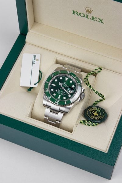
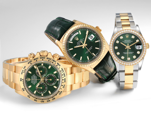
But that makes sense as green does go gloriously well with both steel and precious metals. A green dial can look sporty on a Submariner, flamboyant on a Daytona or surprisingly sophisticated on a dressier watch.
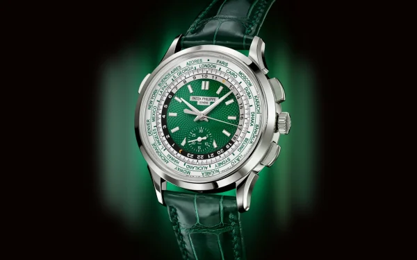
Patek Philippe also joined forces with the shade. Its Complications World Time Chronograph 5930P-001, for example, combines a platinum case with a striking green dial.
Ice blue
If green is confident, ice blue is considerably more refined. This pale, almost silvery shade has become particularly associated with high-end watches and precious metals.
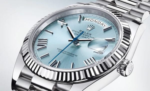
Rolex’s use of an ice-blue dial on platinum models has helped give the colour an almost exclusive status, while other manufacturers have developed their own versions.
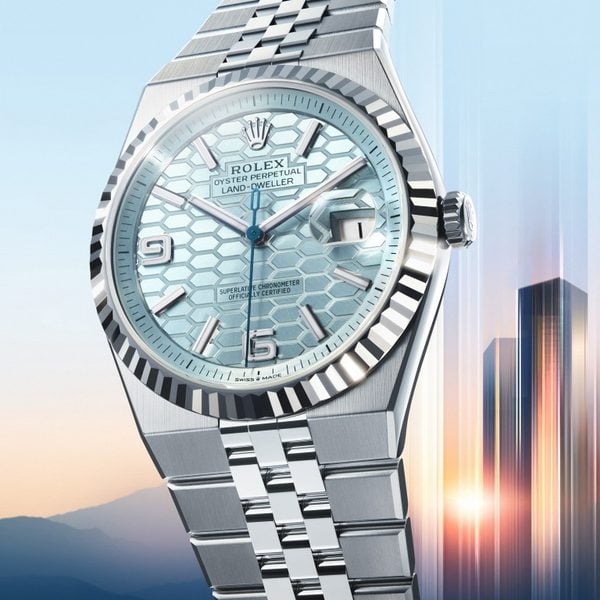
The appeal is partly down to subtlety. Unlike a bright turquoise or emerald green, ice blue doesn’t immediately shout for attention. It catches the light, changes character and gives a precious-metal watch another layer of visual interest.
Blue is still the safe bet
Blue may be the most successful luxury-watch dial colour of all. It sits in its cozy spot between conservative and adventurous. It’s way more interesting than black or white but considerably easier to wear than a bright yellow or turquoise.
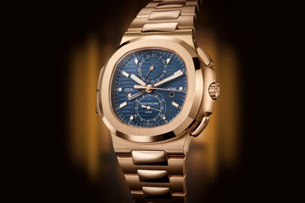
And there are tons of blue watches across the major brands. Audemars Piguet’s Royal Oak is a great example and we have a few of those at the moment with blue Grande Tapisserie dials, including the 39mm Jumbo and 41mm Chronograph.
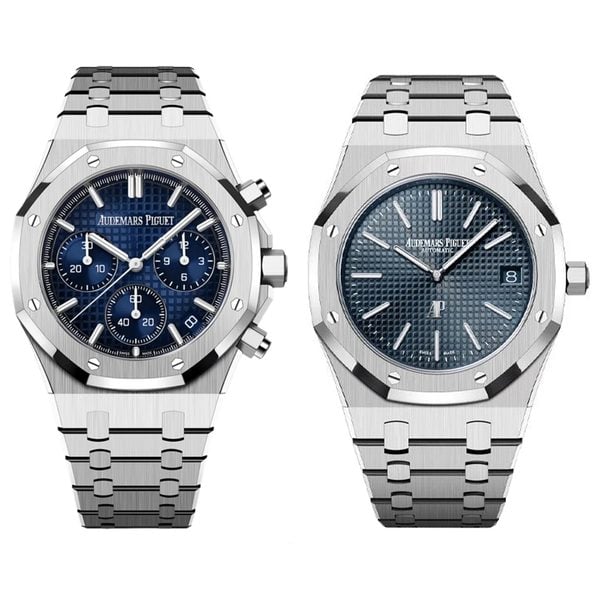
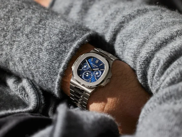
And then there are watches like the Patek Philippe Nautilus, where blue has become almost inseparable from the identity of the collection.
Chocolate, salmon and everything in between
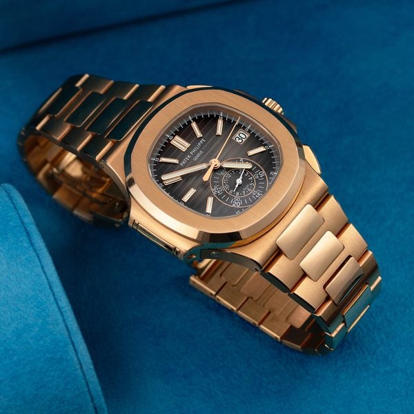
Brown has developed a particularly strong following among collectors, partly because of its connection with vintage watches and naturally ageing dials. Luxe has already explored the renewed appreciation for brown, including its famous appearance on Patek Philippe and Rolex models.
Patek’s 5980/1R-001 Nautilus Chronograph is stunning, pairing a rich brown dial with an 18ct rose gold case and bracelet.
Salmon is another shade that has developed something of a cult following, particularly among those after something out of the box. It’s unusual enough to stand out without being quite as loud as some of the more vibrant modern colours.

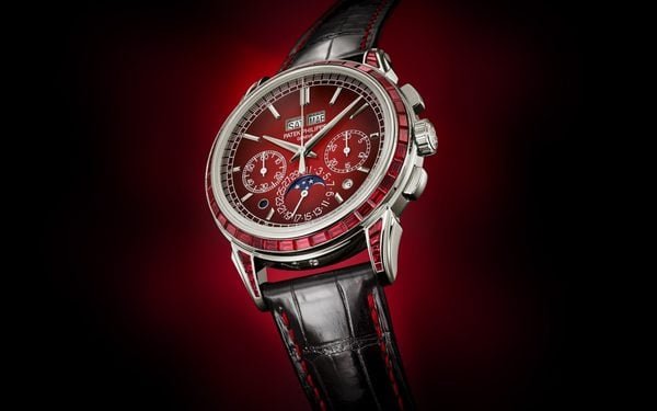
Burgundy always makes things interesting. It’s rich. It’s just unusual enough to feel special. If brands continue experimenting with deeper reds and wine shades, don’t be surprised if collectors start chasing particular references in the same way they currently chase green or turquoise.
What makes a colour collectible?
It’s not simply about picking the most unusual shade. A colour becomes collectible when the colour, the watch and the story come together.
It might be because the shade was only produced for a short period. It could be connected to a particular reference. Perhaps the model was discontinued. Maybe a celebrity happened to make it famous. Or perhaps collectors simply decided that this particular combination of dial, case and bracelet looks fantastic.
Rarity can create demand and sometimes, demand creates rarity. And sometimes, a watch just looks so damn good that collectors decide they need one.
Colour isn’t going away
The days when luxury watches were restricted to black, white and silver (like trainers) are long gone.
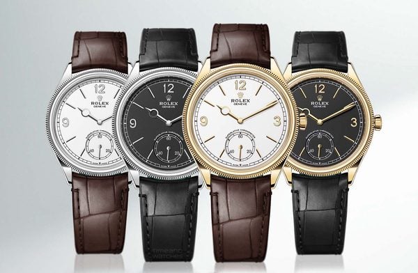
But perhaps the biggest change isn’t that brands are producing more colourful watches. It’s that collectors have become much more interested in the details that make one reference different from another.
And that means the dial can matter just as much as the case or the bracelet. Whether your idea of the perfect watch is a discreet ice blue dial, a vibrant turquoise Oyster Perpetual or a chocolate Patek that looks good enough to eat, there’s never been more choice.
If you’d like to see an array of coloured dials, we can help. Come along to our Epping boutique and try one on for size.